Visualizing Syracuse Series
We naturally plot (x, y) on a plane, but what about complex data ? Series for instance. For this kind, traditional plot does not help. In this article, taking Syracuse series as an example, I describe how to process the data to get a nice 2D plot where some analysis can be performed.
Disclaimer: if you have a firewall, you may not see the figures bellow, which require the bokeh library.
Introduction
Visualization is often considered as a “presentation tool”, which is only valuable for making PowerPoints to novices, for showing numbers, bar and pie charts, and nothing more. Nonetheless, it can be very useful tfor studying data, by looking at how they are organized. Here, I take the example of the famous Syracuse series, where intuitively, plotting the series would be useless. The visualization enables to see kind of tree structures, as only a single small cycle exists.
The Syracuse Series
The formulation is the following:
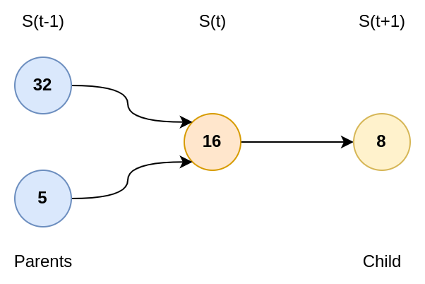
\[S(t+1) = \left\{ \begin{array}{ll} S(t)/ 2 & \mbox{ if } S(t) \text{ mod } 2 = 0 \\ 3S(t) + 1 & \mbox{ otherwise} \end{array} \right.\]It always ends up with 1 and cycle with 4 and 2 until reaching 1 again.
Visualization Protocol
Building a Graph
We can represent the series as a graph. All items have one children (thanks to the series definition), but they have one or two parents (i.e., values which are able to reach it).

If I have the value \(k\), the trivial parent is \(2k\). However, less than one third of the items verify that \(\frac{k-1}{3}\) is an integer. Plus, even numbers follow the first rule. Therefore, on average, you might have \(1/6\) of the items with two parents.
Embedding
There are different ways to visualize a graph.
Force field are common methods, where nodes attract each other up to some point where they start to push them back. The problem with this kind of methods is that they tend to look at first or second neighbors, i.e., at distance \(1\) or \(2\). In our Syracuse case, an item may have 4 neighbors (2 childs and 2/3 parents). This is not enough to get a global view if the system is optimize locally only. We would like to have a big picture.
Steps
Instead, we propose to use “machine learning” embedding approach using \(t\)-SNE algorithm 1. The process is the following:
- Compute the series
- Build the graph
- Make a Random Walk with decay
- Measure Cosine similarity between path
- Transform Similarity to Distance
- Finish by \(t\)-SNE
Steps 1 & 2
We first compute the series and shape it as a graph:
n0 = 2000 # Maximal value used to initate the series

dic = {} # Graph
S = set([i for i in range(1, n0)])

while len(S) != 0:

    c = S.pop()

    if c in dic:
        continue

    elif c % 2 == 0:
        dic[c] = [c // 2]
        S.add(c // 2)

    else:
        dic[c] = [3*c + 1]
        S.add(3*c + 1)
Random Walk and Similarity
Now the graph is computed, we need to explore it, and compute for each item the “influence” of nearest neighbors. We compute this influence using a Random Walk
kmax = 100 # Distance to explore

# Alpha: decay with distance
# Beta: mix in/out

M, dic_idx = ds.matrix_PageRank(set(dic), dic, kmax=kmax, alpha=0.95, beta=1)
D = (1/(0.0001 + M) - 1).clip(0)
The function ds.matrix_PageRank is not presented here for simplicity.
Basically, it computes the random walk for all items up to depth kmax, with a decay factor of alpha.
Next, for all possible pairs, it computes the cosine similarity:
where \(\mathbf{x}\) represents the weights obtained over the random walk as a vector.
The function ds.matrix_PageRank outputs a square matrix M.
dic_idx is just the index of the nodes, as row i might not correspond to \(S(i)\).
The similarity matrix M is next “inverted” to get something looking like a distance matrix D.
Relationship Between alpha and kmax
You can set \(\alpha\) and \(k_{max}\) differently. At distance \(k\), the influence of a node would be \(\alpha^{k}\) (because only one child at each time, so during the random walk, only the decay applies). At some point, it is useless to explore deeper the neighborhood as the weight \(\alpha^k\) will be relatively low.
If you set \(thr\) the weight limit (for instance \(thr=0.001\), i.e. \(0.1 \%\) of influence), then the corresponding \(k\) for a fixed \(\alpha\) is:
\[k > \frac{\log(thr)}{\log(\alpha)}\]Inversely, if the number of steps is fixed:
\[\alpha \approx (thr)^{1/k}\]Embedding
Next, we need to “project” the graph or to “embed” it.
This is done with \(t\)-SNE, which will try to preserve neighborhood as much as possible.
The number of neighbors to consider is governed by perplexity, which greatly impact the final result.
perplexity = 500

Y = TSNE(perplexity=perplexity, metric="precomputed", init="random").fit_transform(D)
Here, we configure the perplexity parameter to 500.
This value is quite large (the default value is 30).
However, here we need to pay attention to long scale distances.
Otherwise, we would get “pieces” rather than a continuum. See the second plot.
Results
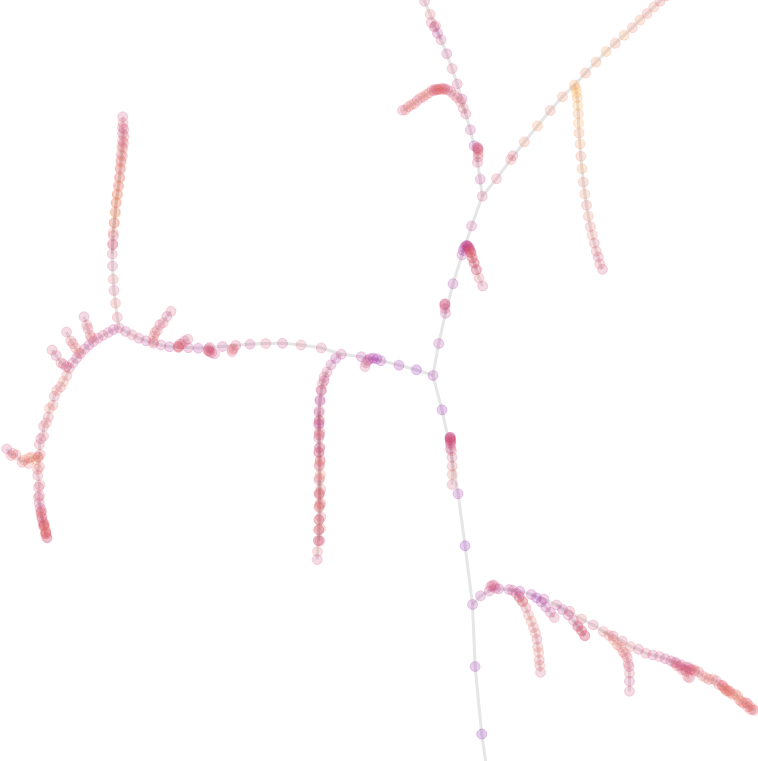
perplexity = 500
Note: Color is proportional to the value, not to the distance from node 1
The structure looks like a tree, or roots, with nice curves merging together.
If you follow the natural curves, they don’t seem to go in the same direction.
But if you follow the path, you will end up in node 1.
There are branches and there are “hard jumps”, which are edges which are much longer than the main edge population. These jumps are functionn of the perplexity. The smaller the perplexity, the larger the jumps would be. We will discuss this later.
Now, the game is to find the ending 1.
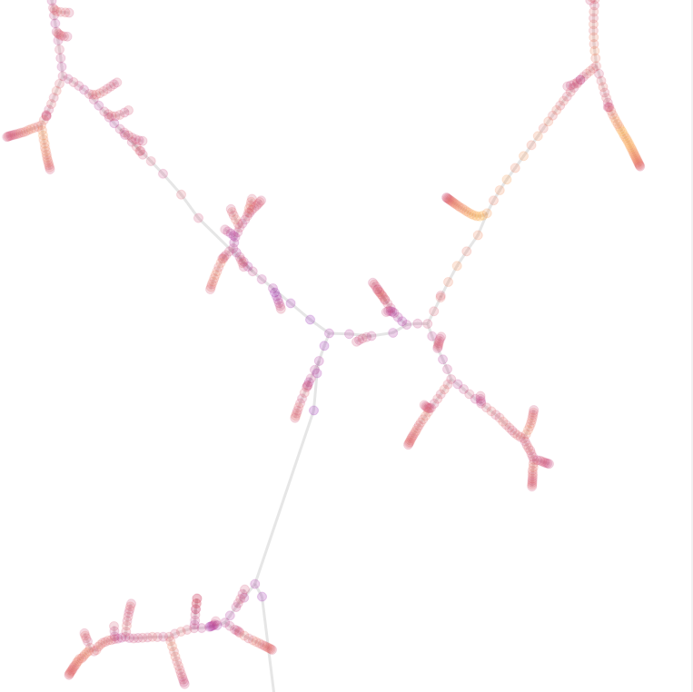
perplexity = 200
Here we just reduced the perplexity parameter. Now, you can see disjoint groups, and high jumps.
You can see that jumps are larger, but branches are also more compact.
When you have a large perplexity, a point would search for many neighbors, and its neighbors will do the same. When we have a fork, i.e., a point which has two parents, two branches came close to each other.
Because of random walk and cosine, the two branches attract each other. However, the points after the fork are less similar to the previous one. To satisfy the perplexity constraint, because they are less similar, they tend to be further away from the forking point.
When the perplexity decreases, the number of neighbors required is even smaller. Therefore, the constraint near the fork is even larger, because of a harder cut.


This two figures have been captured near the node 130
- Left (
perplexity=500): smooth branching structure - Right (
perplexity=300): large distortion visible
Conclusion
What can you do now ?
I would suggest you to look at hash of hashes, and explore the structure and cycles (or look at other series and problems at Euler project).
Epilogue
You can use the following series:
h(0) = vh(1) = h(h(0))h(2) = h(h(1))- etc.
You can search for cycles and values where you can’t come back.
In this exercise, there is a difficulty: scalability. Don’t look at full hash space (\(256^2\) is more than enough), and don’t try to plot all points (\(t\)-SNE does not scale !). Here, the graph bellow is generated the following way:
import hashlib

kmax = 2
n = 256**kmax
print("{} values to process".format(n))

dic = {}
for i in range(n):
    j = i.to_bytes(kmax, "big")

    result = hashlib.md5(j)
    dic[j] = [result.digest()[:kmax]]
Then, because there are too many items, I selected a subset:
index = list(dic)

n_choice = 4000

x_choice = np.random.choice(np.arange(len(index)), n_choice, replace=False)
choice = [index[i] for i in x_choice]
And next, perform the same steps as described before. We get the following result:
Links are between the “two nearest items”. As one selected hash may not have his direct neighbors on the map, we plot the link to the first indirect neighbor (if it exists). You can see that even items are randomly selected, there are bottlenecks and isolated groups.
-
van der Maaten, L. & Hinton, G. (2008). Visualizing Data using t-SNE . Journal of Machine Learning Research, 9, 2579–2605. ↩
>> You can subscribe to my mailing list here for a monthly update. <<